


Obrigado pela atenção / Thank you for watching.
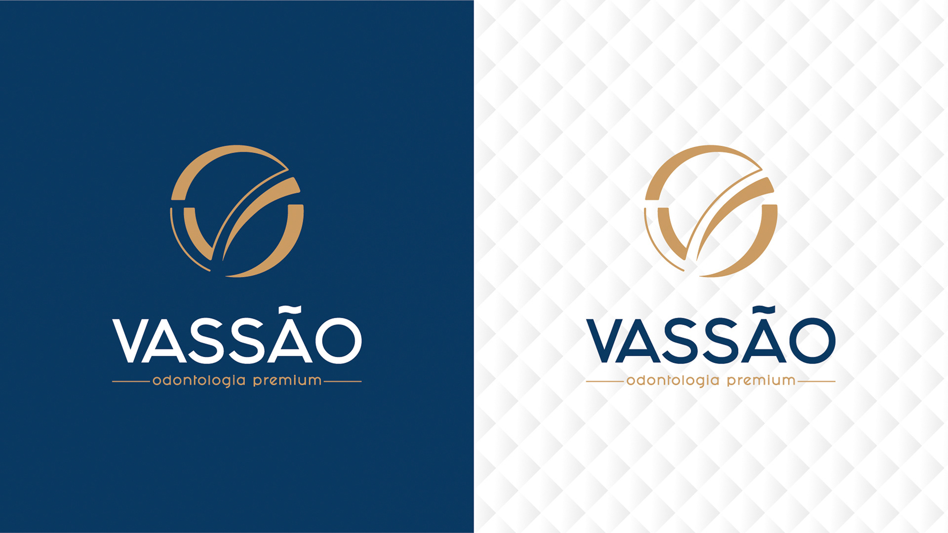
We had a clear goal, to deliver the best in the shortest possible time, and the contribution of teamwork generated the agility and precision needed for this. We started, and before long our research pointed out that the term premium should complete the idea of luxury, exclusive and high standard. Facing the dilemma, we identified the colors that could convey this message and defined the use of a palette with shades of blue and gold. The colors were selected in order to complement the idea of luxury with an image of credibility, rationality and peace.